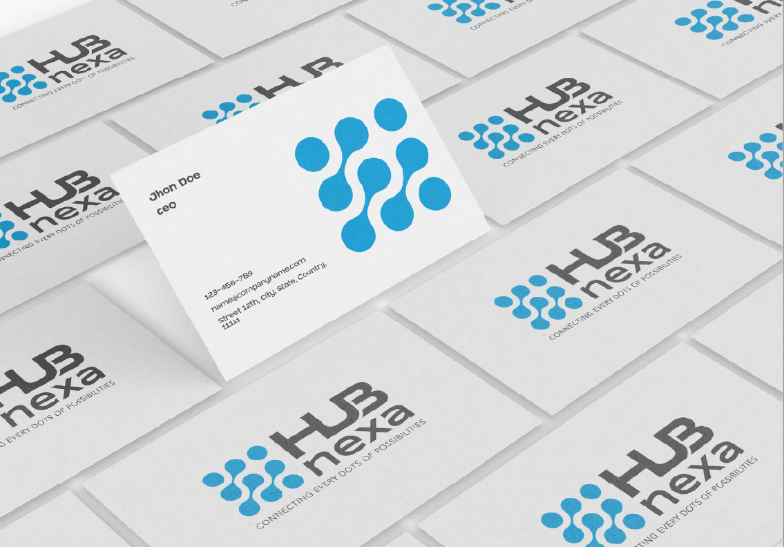
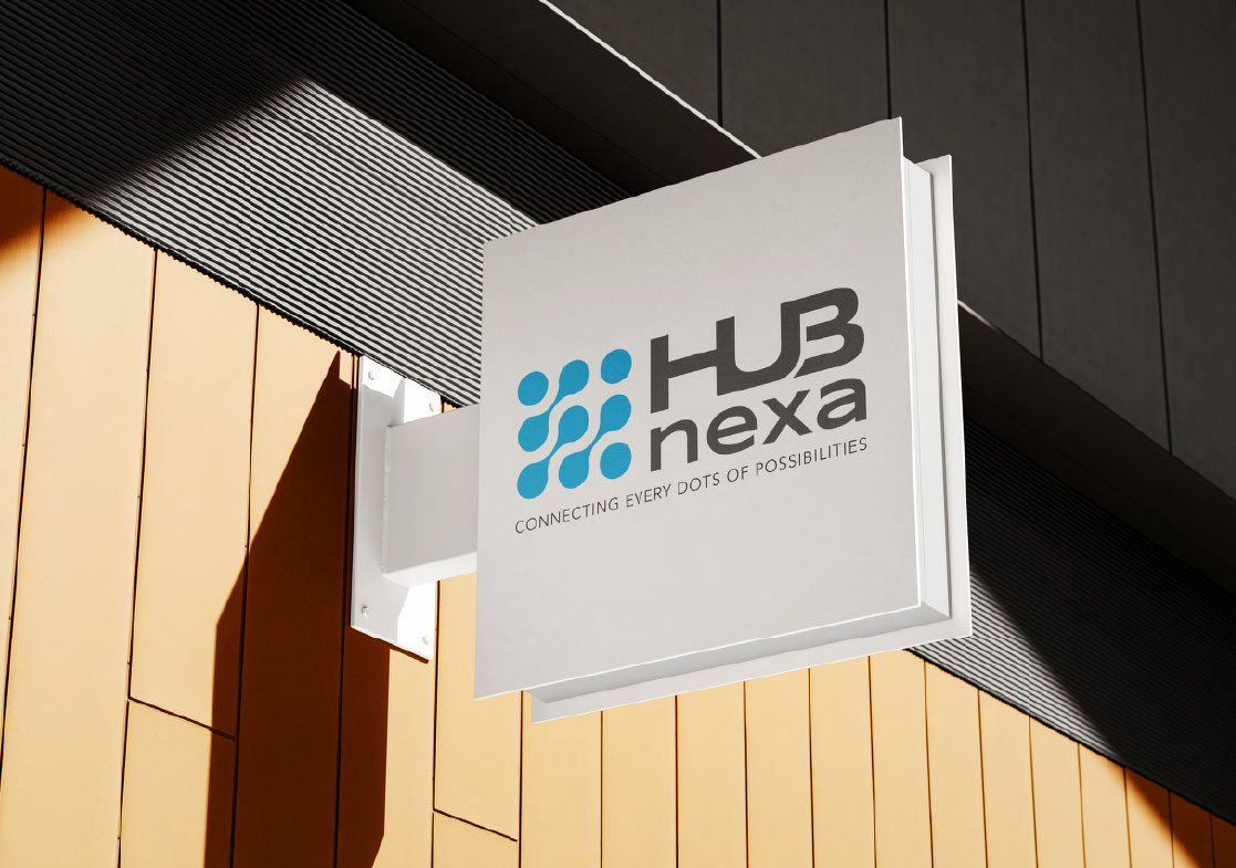
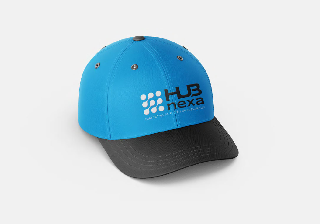
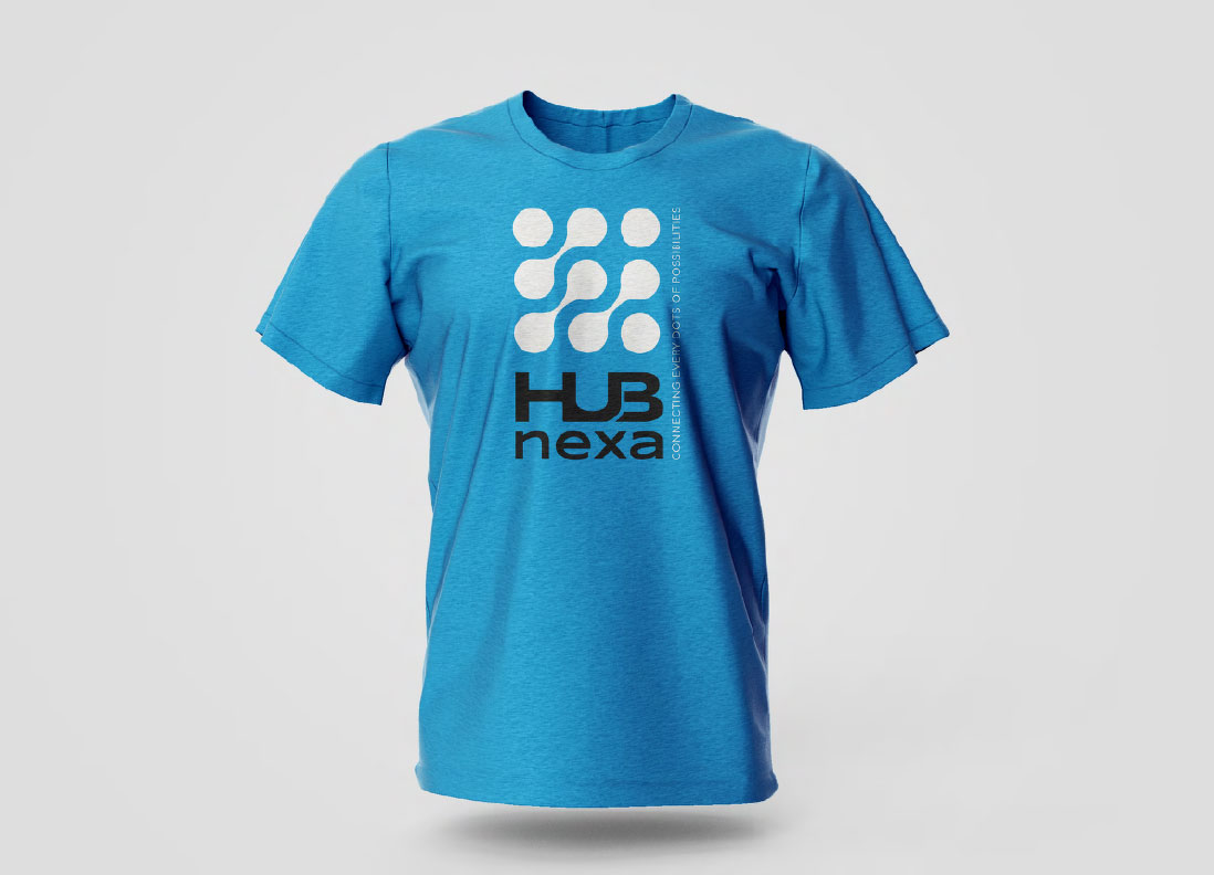
Logo and Branding
Hub Nexa
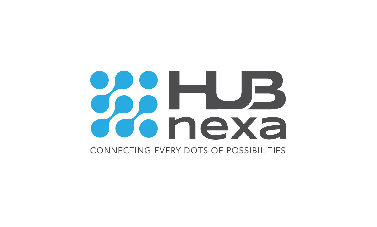
THE LOGO CONCEPT
The logo is designed as a concept of
networking hub and the active
connecting indication signals.

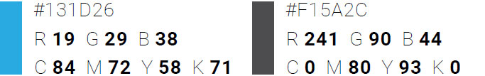
BRAND COLOR
LIGHT BLUE is associated with trustworthiness and reliability.
GRAY represents neutrality and balance.
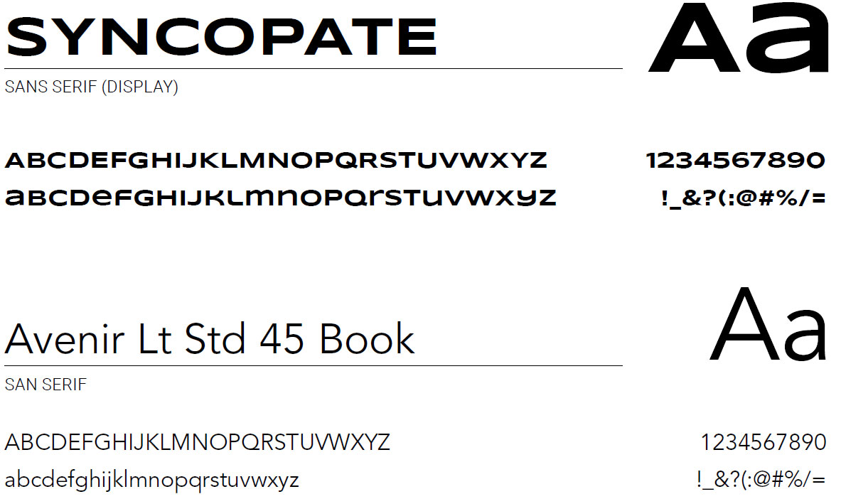
FONTS
Are you impressed by the work?
Start Project With UsThis design is also available for sale. Please contact us, and we can offer you the best deal.